1. Introduction
With online shopping being the primary way people experience products, “exploratory browsing” shopping is rising (Fan & Chiu Reference Fan and Chiu2022), and consumers suffer from the endless flow of product graphics. The typical mode of “exploratory browsing” in online shopping is that, shopping websites use a waterfall flow interactive interface to push product graphics that may be of interest to the viewers. Due to endless products available on the Internet, it is difficult for product to hook viewers’ interest and impression. And at the same time, viewers can not pick out their favourite products quickly. It is essential to engage customers in a single product and prevent them from browsing. Graphics interchange format (GIF) for product presentation (product GIFs), namely, using animated GIFs to present products and enhance consumers’ shopping efficiency and engagement (Bakhshi et al. Reference Bakhshi, Shamma, Kennedy, Song, de Juan and Kaye2016; Mulier, Slabbinck & Vermeir Reference Mulier, Slabbinck and Vermeir2020), has become a trend in multiple domains such as social media ads and shopping apps. They can present a wealth of information in a short time and attract viewers repeatedly (Shu et al. Reference Shu, Wu, Tang, Bach, Wu and Qu2021). Companies such as Alibaba and Nike have employed thousands of product GIFs since 2018. However, most product GIFs have varied quality since they are designed by novice designers in small businesses, or even non-designers like merchants. The large scale of design practice in product GIFs calls for exploration and studies on appropriate design methods and guidelines.
Researchers have validated the superiority of animated GIFs to static PICs as well as other popular dynamic genres (videos/3D simulation and XR) (Bug, P. Reference Bug2020) in various fields. Contrary to static PICs, animated GIFs improve the narrative and vividness of graphics (Segel & Heer Reference Segel and Heer2010), and support viewers to attend to critical information (Lin & Dwyer Reference Lin and Dwyer2010). Especially in the online shopping scenario, well-designed GIFs can make up for the lack of sensory features when consumers cannot physically experience products online (Grewal et al. Reference Grewal, Roggeveen, Runyan, Nordfält and Vazquez Lira2017), so that their attention and emotional resonance are triggered (Khan Reference Khan2016). Moreover, GIFs require lower bandwidth and occupy a shorter duration than other dynamic genres, making the products easier to spread on the network (Bakhshi et al. Reference Bakhshi, Shamma, Kennedy, Song, de Juan and Kaye2016). These studies support the popularity of GIF production. Co-creation platforms have begun supporting animated GIF generation (Liu et al. Reference Liu, Li, Yang and Yang2019a) and involve novice or non-designers to design democratically and quickly (Maselli & Panadisi Reference Maselli and Panadisi2022). Designers propose templates and non-designers complete the animated GIFs. These user engagement and codesign strategies improve novice and non-designers’ efficiency in the codesign process (Efeoğlu & Møller Reference Efeoğlu and Møller2023; White et al. Reference White, Okello, Casey, Najjuuko and Lukanga2023).
Despite the large number of product GIFs, key design factors that help GIFs engage people’s attention are still unclear. Because motion is the unique feature of GIFs that “catches consumers’ eyeball,” recent studies focused on design factors related to motion and their effects on attention. These motion factors include amplitude, frequency, speed and movement (Fasolo et al. Reference Fasolo, Misuraca, McClelland and Cardaci2006; Hamborg et al. Reference Hamborg, Bruns, Ollermann and Kaspar2012; Lee, Ahn & Park Reference Lee, Ahn and Park2015; Li, Huang & Bente Reference Li, Huang and Bente2016; Jia, Kim & Ge Reference Jia, Kim and Ge2020; Hong, Cheung & Thong Reference Hong, Cheung and Thong2021). These studies strengthened the feature of GIFs while having two shortages. First, besides attention, viewers’ interest and impression are also vital goals of GIFs according to the AIDMA model (Wei & Lu Reference Wei and Lu2013) of consumer behavior. These two goals described viewers’ preference to know more about products and their memory of the products. Interest is the key to promoting initial engagement (i.e., clicking behavior) among customers. An effective product GIF then quickly conveys the product’s key features and sustains customer engagement, leaving a lasting impression that continues to impact customers long after they have left the page. The second shortage exists in the exclusion of factors related to graphic design (color, complexity, content and style) and user experience design (affective, cognitive and ergonomic) (Berni et al. Reference Berni, Borgianni, Basso and Carbon2023), which also contributes to the effect of product GIFs. Therefore, studies of GIFs still have difficulties in supporting the production of product GIFs. This article thus aims to answer two research questions:
1) Which design factors enhance viewers’ interest and impression of product GIFs, especially compared with product PICs?
2) Do merchants prefer co-designing product GIFs applying these design factors?
As shown in Figure 1, we conducted mixed methods to answer these questions. To answer RQ1, we first arranged a semi-structured interview and summarized seven design factors of product GIFs qualitatively. Next, we conducted a quantitative study during which over 300 female viewers rated the interest and impression score of 106 GIFs of shoes and corresponding PICs. The two studies revealed key design factors that influence interest and impression. It should be noted that we chose a major population in online shopping as our first exploration in Study 2. Since viewers’ perception and comprehension can be influenced by their own experience or expertise (Lin, Chen & Dwyer Reference Lin, Chen and Dwyer2006), we regulated nationality (Chinese), gender (female) and type of products (women shoes) to control the human-factor variable. Also, a comprehensive exploration is warranted in further studies. To answer RQ2, we conducted a workshop to design product GIFs applying these design factors and posted these product GIF templates on a platform for 2 months to observe reactions from merchants and designers. Merchants prefer these product GIFs over the existing ones. These explorations produced a set of suggestions for designing interesting and impressive product GIFs. Our work might be one of the first studies that focused on the domain of product GIFs and hopefully support the designing of product GIFs in practice.
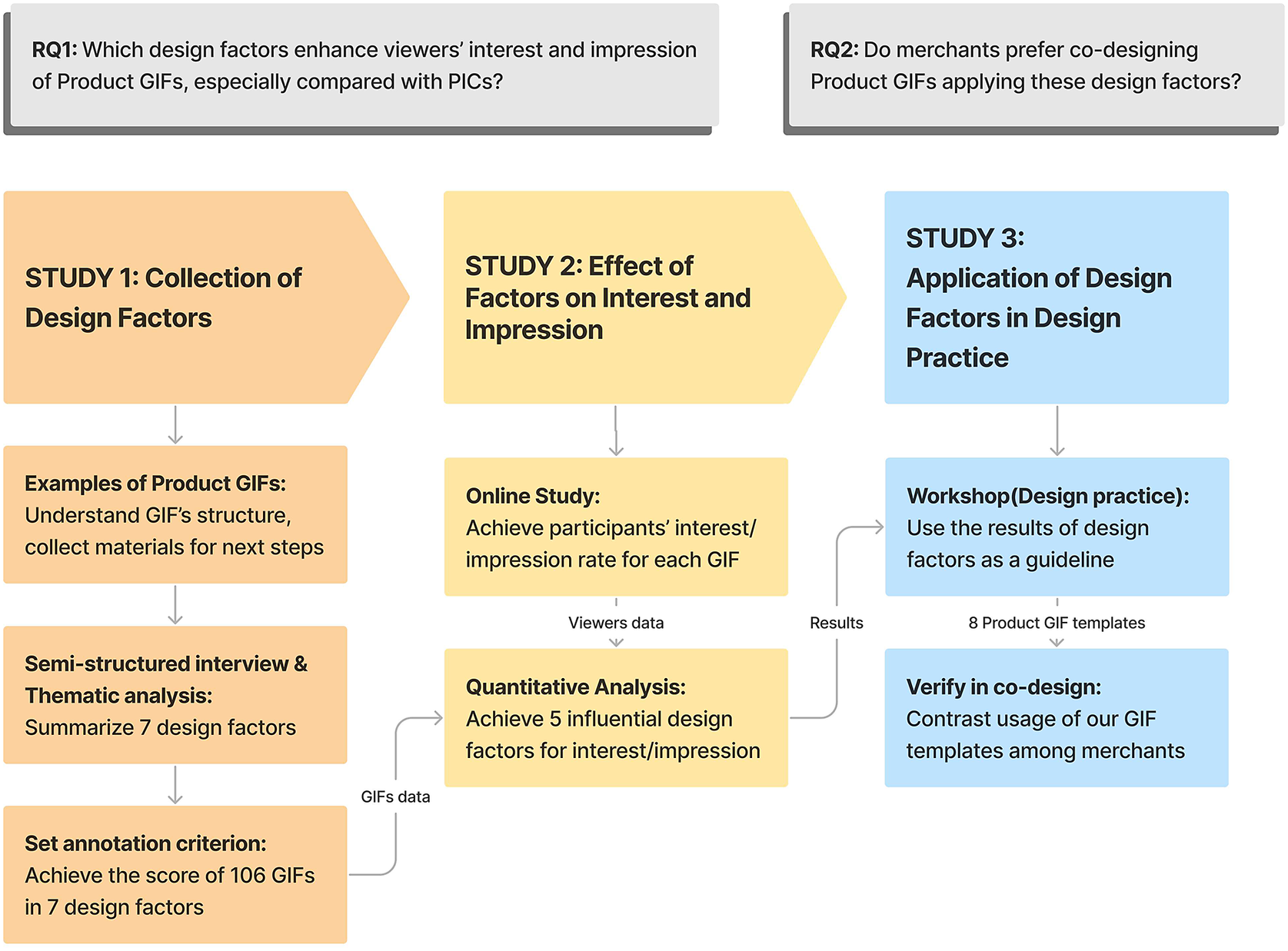
Figure 1. The three studies aiming to answer the research questions.
2. Related work
2.1. Design factors of animated GIFs
Multiple design principles and factors have been proposed by researchers when creating animated GIFs, involving the visual structure of GIFs, object types of GIFs and content of GIFs. The structure of animated GIFs involves five components: figure/ground relation, layering, time and motion, color and transparency, and frame (Gürsimsek Reference Gürsimsek2016). Shu et al. proposed that an understandable animated GIF should involve preserving context, attaching importance to the end frame, using animation to convey temporal process, and so on (Shu et al. Reference Shu, Wu, Tang, Bach, Wu and Qu2021).
Other than structures, the object types in GIFs also affected viewers. Some researchers indicated that concrete or abstract graphics/texts in animation alone can enrich information, but they interact in a negative way (Bashirzadeh, Mai & Faure Reference Bashirzadeh, Mai and Faure2021). Others found that concrete animations are easier to understand because they specify what is being explained (Paik & Schraw Reference Paik and Schraw2013). Abstract animations, on the other hand, tend to direct the viewer’s eyeball to a particular point, thus emphasizing a particular content (Amini et al. Reference Amini, Riche, Lee, Leboe-McGowan and Irani2018). During interpersonal communication, the use of abstract, personified or concrete GIFs indicates the level of intimacy between people (Lin & Chen Reference Lin and Chen2018).
GIF content also plays an important role in viewers’ experience. The context of GIFs, that is, rich stories or settings displayed in the background, is suggested to have a potential impact on product presentation (González, Meyer & Paz Toldos Reference González, Meyer and Paz Toldos2021). The creativity, usefulness and efficiency of content have also been emphasized by many researchers (Luo Reference Luo2002; Smith, Chen & Yang Reference Smith, Chen and Yang2008). Shi et al. recently summarized a design space while designing stories with animated GIFs. This design space introduced several narrative strategies to exchange content (e.g., action, emotion, atmosphere and imagery) with viewers, which was also evaluated as an effective model for creating animated GIFs in a workshop (Shi et al. Reference Shi, Lan, Li, Li and Cao2021a, Reference Shi, Li, Xu and Cao2021b).
The above studies revealed multiple design factors of animated GIFs. Generally, designers considered two aspects of GIFs: visual (combining structure and object) and content. However, these studies seldom involve viewers’ interest and impression of GIFs. When viewers watched a product GIF, they first paid attention to it, then became interested in it and looked for more information, followed by forming an impression of the products after sometime (Wei & Lu Reference Wei and Lu2013). We thus reviewed studies on viewers’ interest and impressions in the next section.
2.2. Design factors and consumers’ perceptions
This section turns to studies of viewers’ interest and impression on a wide range of media types. The advantages of motion have long been demonstrated in psychology, media and visualization (Fasolo et al. Reference Fasolo, Misuraca, McClelland and Cardaci2006; Lu et al. Reference Lu, Fish, Wang, Lanir, Cohen-Or and Huang2020; Mulier et al. Reference Mulier, Slabbinck and Vermeir2020). Due to acute motion perception, the human eye is easily attracted to dynamic objects (Yarbus Reference Yarbus1967). It has been confirmed that motion is also beneficial to enhance the persistence of viewers’ memory (Xu & Sundar Reference Xu and Sundar2016). Researchers have confirmed through eye-tracking experiments that the shorter duration (Lee et al. Reference Lee, Ahn and Park2015; Bakhshi et al. Reference Bakhshi, Shamma, Kennedy, Song, de Juan and Kaye2016), the greater the range of motion (Hong et al. Reference Hong, Cheung and Thong2021) and the larger proportion of the media on the page (Hamborg et al. Reference Hamborg, Bruns, Ollermann and Kaspar2012; Li et al. Reference Li, Huang and Bente2016), the more attractive and impressive the media is. However, high-intensity movement is not always good; the perception would be badly affected by excessive speed, while slow motion limits the richness of communication (Li et al. Reference Li, Huang and Bente2016).
Other than motion, a variety of design factors related to the visuals and content also affected viewers’ perceptions. For visual-related factors, Borkin indicated that attributes such as color and the addition of identifiable objects enhance impressions. That is, ordinary objects are less memorable than unique types of objects (Borkin et al. Reference Borkin, Vo and Bylinskii2013). In addition, visual components such as color and layering may impact the holistic feeling of a graphic. For example, the lightness and chroma of colors may change consumers’ expectations and their imagination of the product style (Wei Reference Wei2014; Celhay, Magnier & Schoormans Reference Celhay, Magnier and Schoormans2020). As for the forms and quantities of content, contextual text (González et al. Reference González, Meyer and Paz Toldos2021) as well as discounts (Huang Reference Huang2018) are the most attractive message for consumers. The increasing number of features in product presentation results in a positive improvement in visual, cognitive and emotional responses (Boardman & McCormick Reference Boardman and McCormick2019). Though designers want to express as much information as possible, the number and quality of features displayed should be considered seriously as GIFs are short and concise (Shu et al. Reference Shu, Wu, Tang, Bach, Wu and Qu2021). As Lai et al. mentioned, animation improves viewer attitudes when it fits product features (Lai et al. Reference Lai, Kuan, Hui and Liu2009).
However, certain features of animation can be confusing and have a negative impact on people’s perceptions. These features include, but are not limited to, the lack of creativity in the content or visual expression (Lehnert, Till & Carlson Reference Lehnert, Till and Carlson2013), unnatural movements or motions against viewer’s mental model (García García et al. Reference García García, Costanza, Verame, Nowacka and Ramchurn2021), backgrounds or designs that are too complex (Liu, Liang & Liu Reference Liu, Liang and Liu2019b), irrelevant or unclear expression (Zeng, Kohno & Roesner Reference Zeng, Kohno and Roesner2021).
In general, existing studies in product design and advertising have shown that several design factors did affect perceptions. Some applied certain factors to practical design through workshops. Although these studies did not focus on the area of product GIFs, they still provide valuable references. We then referred to these to collect design factors that might affect interest and impression.
3. Study 1: Collection of design factors
3.1. Examples of product GIFs
Product GIFs present goods by visualizing their features. To better understand the impact and design points of product GIFs, we first investigate existing product GIFs online and conclude their structure and compositions.
Product GIFs add dynamic effects with product graphics to display diverse information involving features, styles and contexts. Referring to the framework of animated GIFs (Gürsimsek Reference Gürsimsek2016), the structure of product GIFs can be divided into three layers: background layer, product layer and element layer. The background layer shows the scenarios, and the product layer contains graphs of products. The animation in the two layers includes shot change, color change and displacement. The element layer adds dynamic objects to present the features and information of products, which cover a broad range from abstract/natural patterns to data, being the core of product GIFs.
Here, we use a case to explain the structure of product GIFs. Figure 2 displays a product GIF of a shoe, in which animated “snowflakes” support the snowy background, indicating the shoe’s usage scenario. Also, there are animated “warm circles” and “temperature contrast data” embedded in the GIF to highlight the thermal insulation properties of the shoes. Meanwhile, the shoe graphic “floats up and down” in the product layer to match the overall coordination of the product GIF.
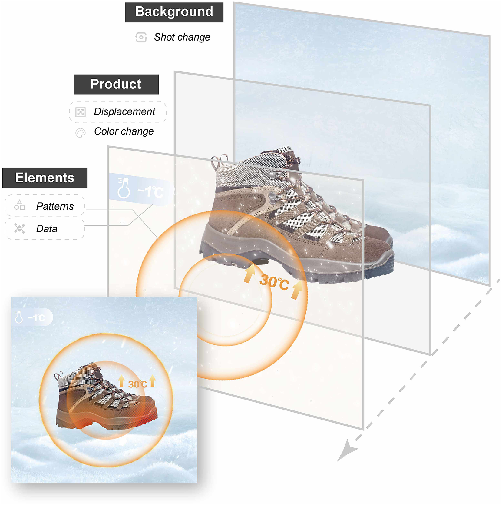
Figure 2. An example to show the structure of product GIFs.
3.2. Semi-structured interview and thematic analysis
Our exploration started with a semi-structured interview that explored which design factors influenced viewers’ interest and impression of product GIFs compared with product PICs. This interview might complement the design factors found from the prior papers.
Before the interview, we collected 23 product GIFs and 26 product PICs from designer websites (Pinterest, Instagram, etc.) and online apps (Taobao, Tmall, etc.). These GIFs presented the products we use in daily life, including clothes, shoes, make-up, food and other necessities. All GIFs and PICs were put in a shopping scenario because it allowed the presentation of varied products. Participants could scroll down pages to view these randomly arranged GIFs and PICs as they did in daily lives.
We recruited 15 participants by posting experimental information on the campus forums (5 males and 10 females, aged from 18 to 30). The interview took about 20–30 minutes and involved three stages: introduction, free browsing and discussion. They were rewarded 20–30 yuan (3–5 dollars) depending on the length of the interview.
First, participants were introduced to the experimental procedure. They were asked to view products and talk about their feelings. We did not mention the word “GIF” and “PIC” to avoid deliberate cooperation.
Second, each participant browsed the GIFs and PICs on the pages freely (as shown in Figure 3). After browsing, they are asked to put down the phone, propose the most impressive products and explain the product features they remembered. Afterward, participants were shown the pages again and asked why they noticed some but dismissed others. Products that interested them most (the ones they want to click on and learn more about) were selected by each participant as well.
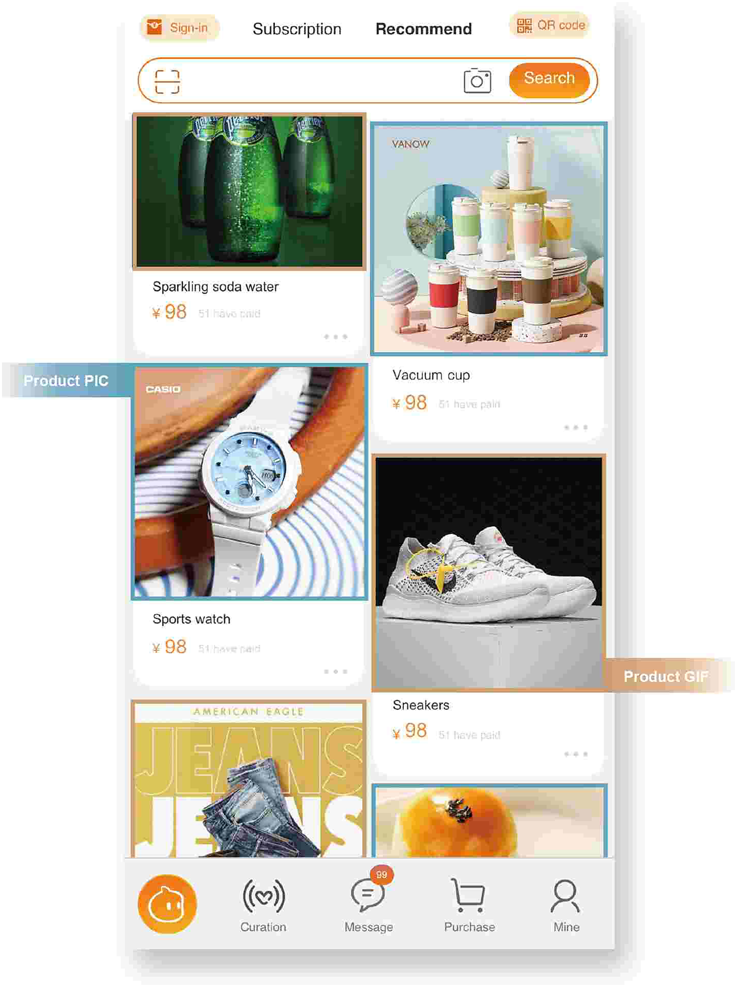
Figure 3. The pages participants viewed (blue frame marks PICs and orange frame marks GIFs, they are all collected from Pinterest).
After the interview, we employed a thematic analysis framework to explore the design factors. First, we coded possible factors mentioned in the interview. The factors were marked when (a) participants proposed that some factors interested and impressed them, (b) participants described their perceptions and interpretations of product GIFs/PICs and (c) participants proposed personal feelings. For example, one of the feedback texts, “The green color of the soda is more obvious than the surrounding objects, and the floating bubbles are natural and eye-catching. Just like real soda, it gives me a feeling of quenching my thirst and cooling off,” is coded as “obvious color,” “concrete,” and “immediate demand.” This step produced a total of seven design factors.
3.3. Annotation of design factors
Then, we collected GIFs to annotate the design factors using a seven-point Likert scale. As an initial exploration, this study collected 106 GIFs of women’s shoes from online platforms including Pinterest, Behance, Dribbble, Taobao and Giphy. Women’s shoes have rich features and are familiar to most people as daily goods. Also, it is an important product category for online business. Additionally, the length of GIFs is controlled between 3,000 ms and 9,000 ms because it is found to be the optimum presentation time for perceptual experience (Pei, Huang & Ding Reference Pei, Huang and Ding2022). Three researchers with design-related backgrounds first drafted a labeling standard. Then, two researchers independently scored the seven factors of 106 GIFs on a seven-point scale referring to the criteria. Therefore, we obtained two sets of data with 742 scores (7*106), which were analyzed using IBM SPSS Statistics V25 and reached high inter-rater reliability (Pearson’s r = 0.674). Finally, all participating researchers calibrated the labeling criteria based on the average scores given by the two researchers and agreed on a consensus score (all scores are integers and range from 1 to 7).
3.4. Results
The interview results showed product GIFs impress and interest people most of the time. On average, participants recalled the product GIFs three times more often than the product PICs. At the same time, most product GIFs were of interest to the participants. Otherwise, very few product PICs get clicked. Some participants explained that they only got interested in the product PICs displaying products they preferred or had recently purchased. In the end, we got 498 feedbacks about product GIFs and PICs.
All the interview texts were first annotated into total 30 codes, and then integrated into several categories referring to the factors proposed in published articles. For example, “obvious movement” and “moving range” were classified as “motion intensity.” This step produced eight categories. These categories were further summarized into three themes including visual-related factors, content-related factors and personal factors (Figure 4). The coding categories and their frequencies provided initial results that might affect interest and impression. Next, we mainly focused on the seven design factors in visual-related and content-related themes.
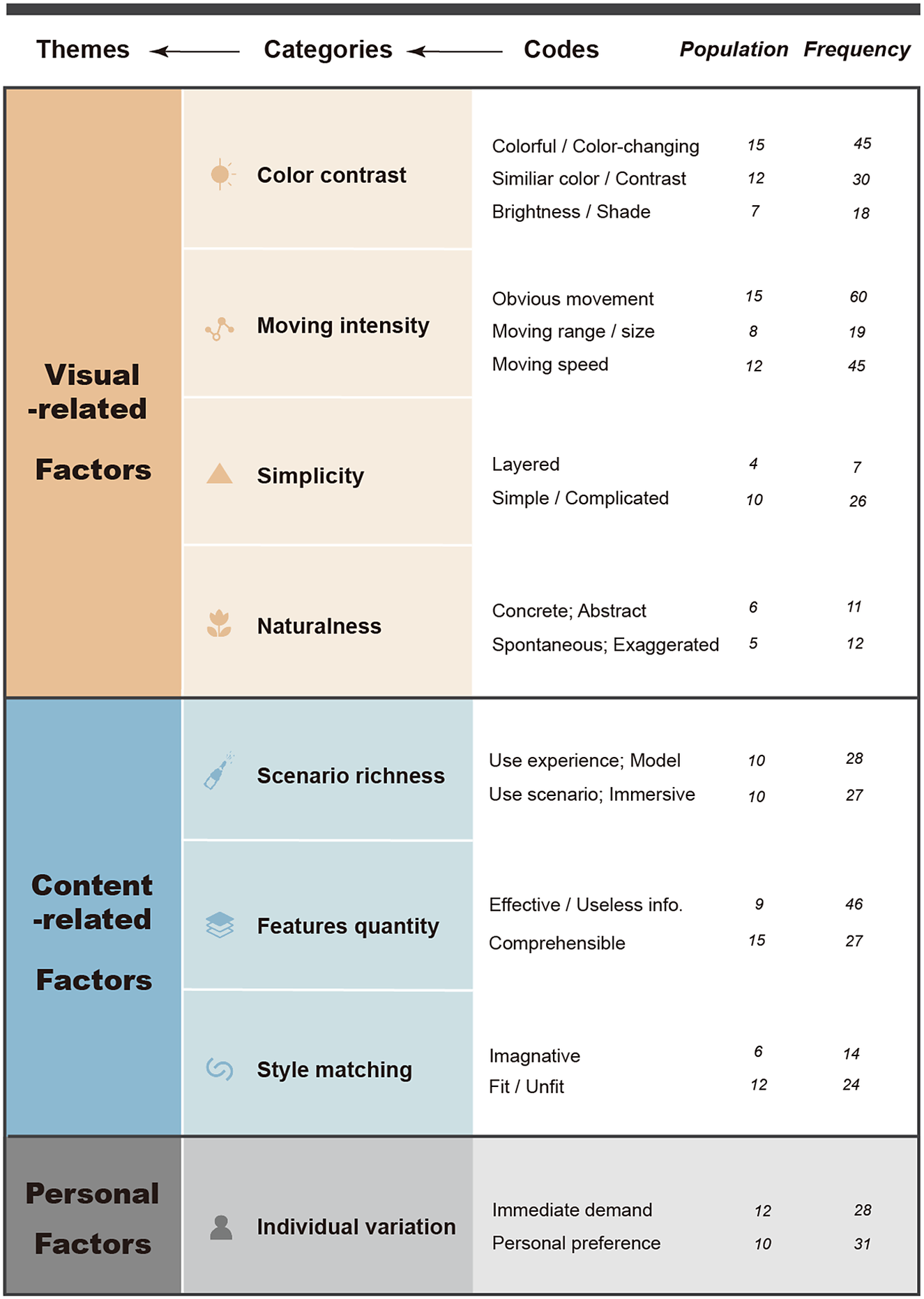
Figure 4. Summarized design factors.
Distribution of scoring data for each design factor of the 106 GIFs is shown in Figure 5, and the examples of scores for visual-related and content-related factors are, respectively, shown in Figures 6 and 7.
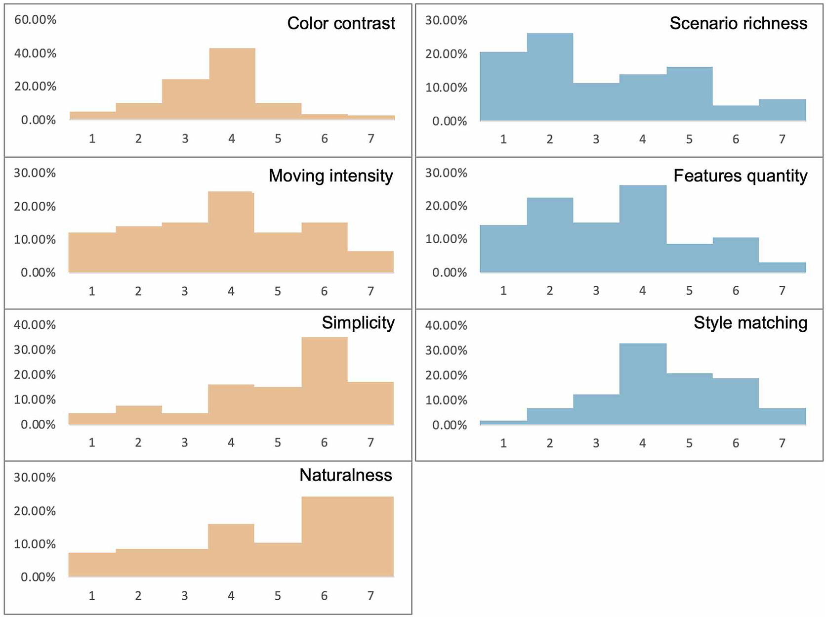
Figure 5. Distribution of scoring data for each design factor.
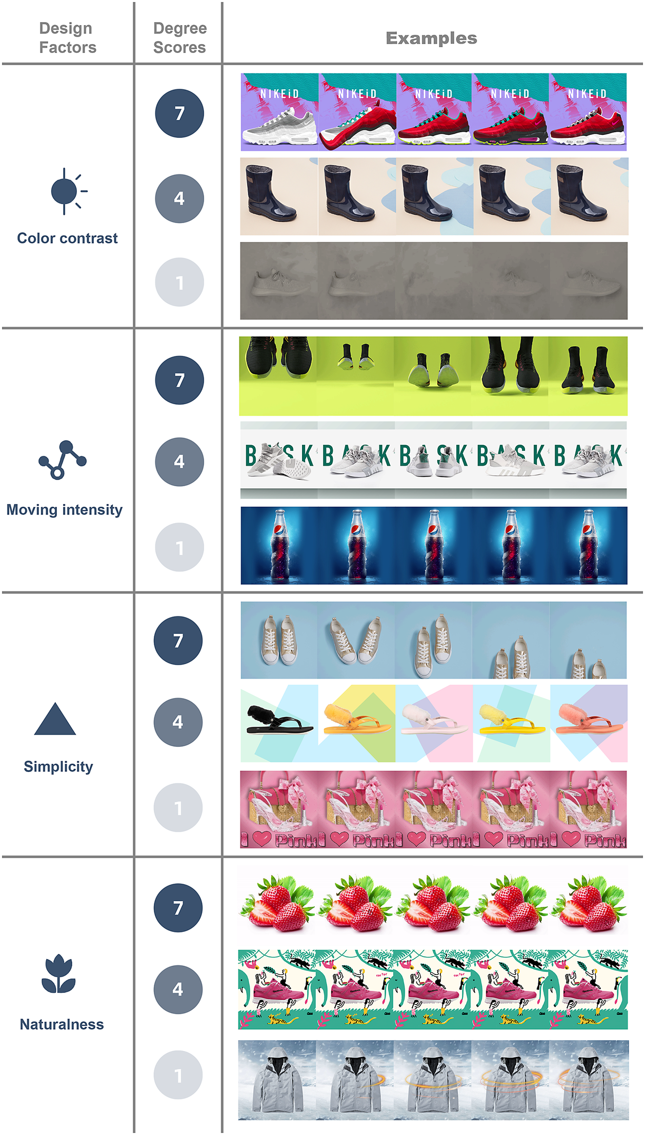
Figure 6. Score examples of visual-related factors. (Examples are all collected from Pinterest)
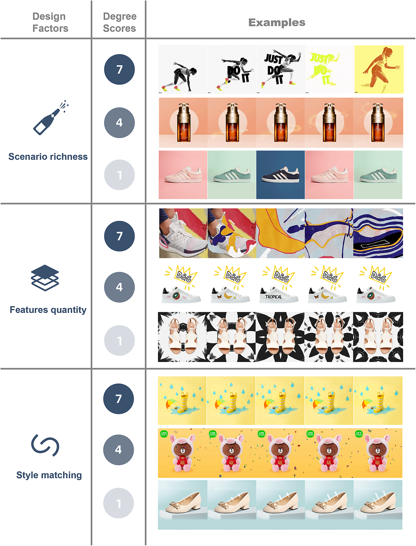
Figure 7. Score examples of content-related factors. (Examples are all collected from Pinterest)
3.4.1. A. Visual-related factor
F1: Color contrast
Color contrast was rated considering the color contrast among the products, the background and the animated elements. If the color contrast between the product images and background is obvious, we score 4. If there is also an obvious contrast among the products, the backgrounds and the animated elements, we score 7.
F2: Moving intensity
The moving intensity is scored by measuring both the moving range of animated elements and the size of the animated area. If both are large, we scored 7. We scored 4 if both are medium, or one is large while the other is small. If the motion is hard to recognize, we scored 1.
F3: Simplicity
Simplicity refers to whether the layout of elements and background in the graphic is simple. Therefore, we scored 7 for those GIFs that were simple and organized, and in which the product is obviously noticeable. Complex and unreadable ones were scored 1. We scored 4 if the product’s outline is clear but the overall picture is a bit complicated, as shown in Figure 6 (simplicity-4).
F4: Naturalness
The degree of naturalness refers to both the visual elements and the motion styles of a product GIF. We scored 7 for GIFs using natural elements and moving in accordance with the laws of nature, and 1 for graphic and iconic elements and unnatural motions.
3.4.2. B. Content-related factors
F5: Scenario richness
Scenario richness refers to whether the elements and backgrounds display the usage scenario of a product. If there is no context or animated element in the background, we scored 1. If the GIF shows the motion state or context when the product is used, we scored 4. The score 7 indicated that this GIF builds a realistic scenario including rich information such as weather and surrounding contexts. An example of this can be seen in Figure 7 (scenario richness-7), where a scenario that displays the feelings of using the sneakers with the model’s action, flash elements and slogans is shown.
F6: Feature quantity
Feature quantity refers to the amount of information shown in GIFs. If a product GIF presents a lot of product features such as brand, colors and styles, we score 7. A GIF with hard-to-find product features would be scored 1. As shown in Figure 7 (features quantity-7/4/1), the upper two GIFs present varied appearances, brands and usage of the shoes, while the lower one, with a dynamic kaleidoscope background (black and white), presents little information about the products.
F7: Style matching
Style matching refers to whether the background and animated elements match the products. We scored 7 for high relevance and 1 for low relevance. As shown in Figure 7 (style matching-1), the airstream elements added in the animated GIF are normally used in sneakers and destroy the elegance of high-heel shoes. It is worth noting that the degree of style matching is also affected by region and culture (Forceville Reference Forceville1994).
4. Study 2: Effect of factors on interest and impression of product GIFs
The first study allowed us to identify the factors that enhance viewers’ interest and impression of product GIFs. To increase the validity of this research, we performed a quantitative study that focused on the effect of factors and further investigated how these factors are related to interesting and impressive product GIFs.
4.1. Hypotheses
We formulated the following hypotheses.
H1 – The seven design factors would increase participants’ interest of GIFs.
H2 – The seven design factors would increase participants’ impression of GIFs.
H3 – The effect of the seven design factors differs. Visual-related factors might induce high interest of GIFs, while product-related factors might induce high impression of GIFs.
4.2. Materials and procedure
This section measures participants’ reactions to the 106 GIFs collected in the prior study. To analyze the improvement brought by GIFs, we made the corresponding product PICs which keep only the product layer of GIFs, and measured participants’ ratings of both PICs and GIFs.
The online study included the interest stage and the impression stage, as shown in Figure 8. The interest stage asked participants to rate their interest of 10 GIFs and 10 PICs using a seven-point Likert scale. There were five questions about the participants’ personal information, of which four were demographic information and one was about their utilitarianism or hedonism tendency (Roggeveen et al. Reference Roggeveen, Grewal, Townsend and Krishnan2015), which is an influential factor. Researchers have reported that hedonistic viewers were more likely to be motivated by fun, dynamic media, while utilitarian viewers preferred intuitive media (Lai et al. Reference Lai, Kuan, Hui and Liu2009; Roggeveen et al. Reference Roggeveen, Grewal, Townsend and Krishnan2015). There is also a golden standard question that asked participants to “Choose ‘Disagree (1)’ in this question.” We made 10 questionnaires so that each participant only needed to rate their interest of around 10 GIFs and 10 PICs.

Figure 8. Experimental procedure in the online study.
The impression stage was arranged 24 hours after the interest stage according to the Ebbinghaus forgetting curve (Murre & Dros Reference Murre and Dros2015). It involved two pages showing product GIFs and product PICs.
One-fourth of the product GIFs and product PICs had been seen by viewers on the previous day, and the other three-fourths were distractive ones that participants had not seen before. The impression scores for the product GIFs and product PICs were calculated by the participants’ recognition rate.
A total of 307 validated female participants between the ages of 18 and 30 (88.89% are between 20 and 24) joined in the interest stage through online campus platform and email invitations. A total of 290 participants continued to take part in the impression stage. Participants were remunerated 5 yuan (0.8 dollar) for completing the whole experiment and passing the golden standard question.
4.3. Quantitative results
Participants like GIFs more than PICs. The average score of interest for product GIFs was 3.50, while the interest score for product PICs was 2.62. The recognition rate of product GIFs was 63%, while participants remember only 53% of the product PICs.
To emphasize large improvements of high-quality GIFs, we calculated the final interest and impression score using this formula: Score (interest/impression) = score of product GIF × (score of product GIF – score of product PIC). Participants’ utility/hedonic ratings were included as covariables in analyses. Regression analyses displayed that design factors significantly affected both interest (R 2 = 0.161, F = 3.718, p = 0.004) and impression (R 2 = 0.118, F = 3.718, p = 0.004).
As shown in Table 1, moving intensity affected the interest significantly. Color contrast also has a certain effect on interest. Higher color contrast and higher motion intensity in GIFs makes the viewers more interested in the product. As reported before, motion intensity has a larger effect than other design factors. It is worth noting that naturalness did not significantly affect participants’ interests. Both natural and unnatural designs work well.
Table 1. Influential design factors for “interest”

Two content-related factors involving scenario richness and style matching significantly affected viewers’ impression of product GIFs (Table 2). Simplicity, as a visual-related design factor, is also worth noting. To conclude, GIFs showing rich contexts, GIFs that have matching elements, and GIFs with simple visualizations leave a deep impression on participants.
Table 2. Influential design factors for “impression”

5. Study 3: Application of design factors in design practice
Motion design, including GIF design, acts as a particularly accessible domain due to its low barriers to entry (Liang et al. Reference Liang, Sit, Chang and Zhang2016). Product GIF design constitutes a transdisciplinary and codesign framework, where designers excel in formulating design and merchants have superior insights into their products and target users.
Based on the framework for codesign from Gaete Cruz et al. (Reference Gaete Cruz, Ersoy, Czischke and Van Bueren2023), we conducted a process-oriented approach. The prior investigations analyzed the opinions of merchants, viewers and designers. Collaborative activities with participants from a variety of backgrounds fostered a common understanding of product GIFs, indicating that a product GIF with visual-related and content-related design factors is interesting and impressive. In this section, we continued a workshop to examine our findings in design practice.
This process followed the method of “diffuse design” (Maselli & Panadisi Reference Maselli and Panadisi2022) and was applied on Luban, an open and intelligent co-creation platform that supports multimedia content design with AI technology (Liu et al. Reference Liu, Li, Yang and Yang2019a). Merchants and designers produce GIFs together to present their products based on templates. First, we recruited participants to design product GIFs guided by our empirical findings. Designers must be able to explore the possibilities of guidelines in order to crystallize their ideas. Then, these product GIF templates were posted on Alibaba’s Luban platform to examine their effects. In this way, merchants are empowered to adapt the congruent GIF templates to their own products.
5.1. Workshop
Participants learnt how to design product GIFs according to the results from Study 2. They jointly designed several product GIFs, among which 8 for women’s shoes were posted on Alibaba’s Luban platform for merchants to use.
5.1.1. Participants
Five designers (three females) participated in the workshop. These designers involve three industrial design undergraduate students (3 years of design learning experience on average) and two interaction designers working for Alibaba (3.5 years of design experience on average). All of them have experience in animation design.
5.1.2. Task
We conducted this workshop to validate the usability of our results on design factors. Participants need to design product GIFs that make use of the prior design factors. Their design targets are restricted to four classic types of women’s shoes as shown in Figure 9. The details of each shoe’s features, such as style, function, texture and index, were provided by merchants so that participants could have a reference. The design would be made into templates so that merchants can apply our design in their GIFs directly.
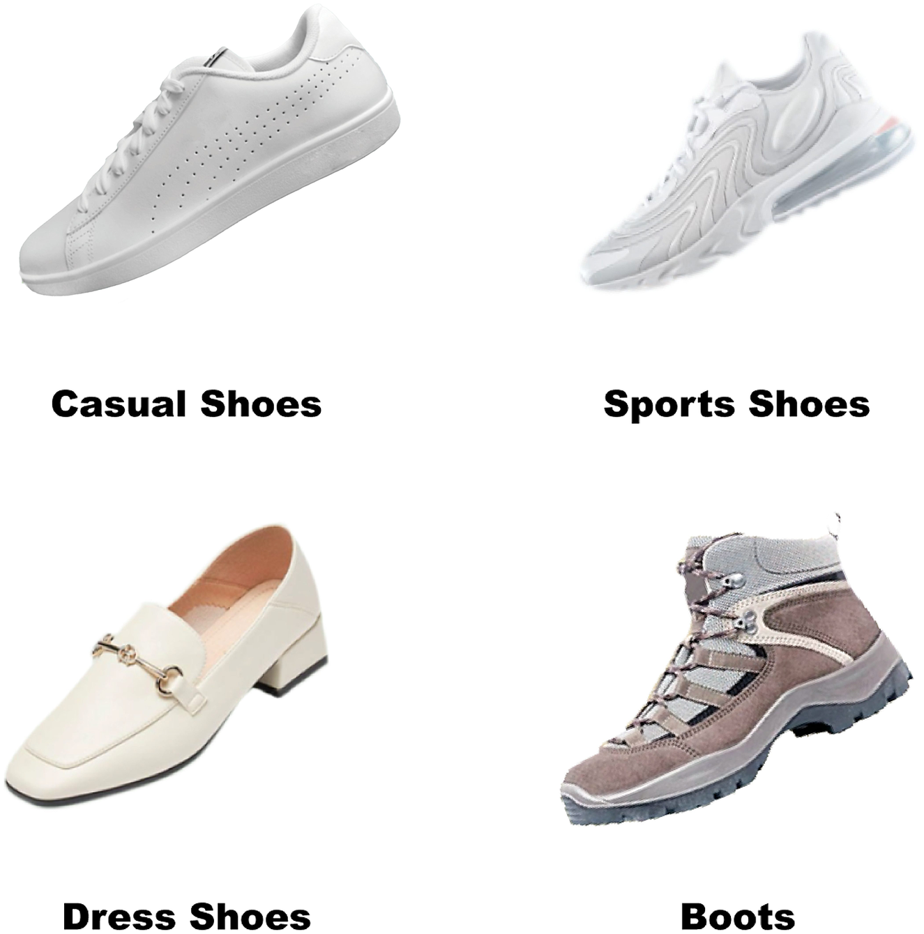
Figure 9. Four types of women’s shoes.
5.1.3. Procedure
The workshop started with a 20-minute introduction. We first make sure participants understand the concepts of product GIF and the method of creating it, mainly by introducing the purpose and design structure of product GIF (the references are from Study 1). Then, we introduced our research findings and presented the experimental materials used in Study 2, to show participants the reflection of our study results in different product GIFs.
We asked each participant to produce product GIFs based on seven design factors. They could select materials from the commercially available material libraries and make 1–2 product GIFs. During the practice period, we offered help to the participants at any time, so that they would have a deeper understanding of study results and master the skills of using them. The content factors recommend information for effective visualization. When participants conceptualized GIF design through textual description, they would attach importance on the products’ use scenarios and styles. Additionally, the visual factors referred the way of expression. The selection of colors and animated effects should highlight the product or its features, with a preference for simple design. Importantly, participants retain authority in selecting the type of elements to realize their ideation.
According to effective design factors, the methods participants could use are not limited to changing the color of the product picture to enhance the color contrast (design factor: color contrast), defining the products’ style and use suitable elements (design factor: style matching), adjusting parameters to enlarge animated effects (design factor: moving intensity), removing overly cluttered elements to adopt a simple design (design factor: simplicity), imaging the user scenarios and choosing suitable patterns to simulate the product experience (design factor: scenario richness).
After the practice period, each designer started to design product GIFs and made four product GIFs on average. After a week of GIF design, participants reunited to show their product GIFs and share their own ideas and problems. Each GIF was then evaluated and refined by participants so that these GIFs meet the requirements of the study results.
Finally, we selected the participants’ designs that fit with our study results and modified the source files of product GIFs according to the platform (Luban) requirements. In this platform, the merchants could use these design templates to complete their own product GIF design easily by replacing the subject with their product image and effect. We expected that our template would outperform the existing ones. As an initial exploration, we delivered eight valid GIF templates on Luban for 2 months. Figure 10 shows the final effect of the eight templates.
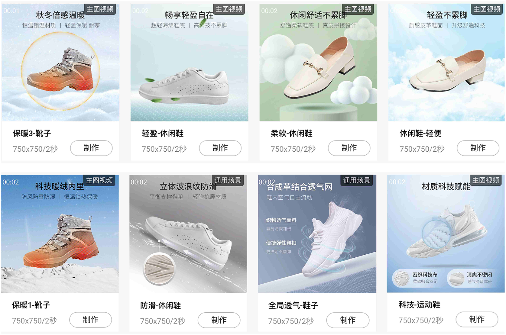
Figure 10. Eight product GIFs designed by our workshop on the Luban platform.
5.2. Usage of product GIF templates
Feedback from the platform shows that merchants preferred using our product GIFs while promoting their products to consumers. Just 2 months after product GIFs were launched, these templates have been used 4,969 times. Among the eight templates, two templates designed for dress shoes ranked first and second in the “template TOP list,” surpassing all the original GIFs, reaching 1,281 and 1,159 times, respectively. The average number of template applications for casual shoes, sneakers and boots was 479, 758 and 27 times, respectively, exceeding the average template usage for the same category on the platform. It should be noted that our design was released in the summer, so the boots were used sparingly. The data from the real business platforms show that the application of design factors in design templates helped designers create influential and popular product GIFs in design practice.
6. Discussion
6.1. Design factors affecting the interest and impression of product GIFs
Product GIFs, as a popular graphic design form on social websites and online shopping platforms, display product features and engage viewers (Bakhshi et al. Reference Bakhshi, Shamma, Kennedy, Song, de Juan and Kaye2016; Mulier et al. Reference Mulier, Slabbinck and Vermeir2020; Fan & Chiu Reference Fan and Chiu2022). Existing studies on animation have proposed two types of design factors that enhanced viewers’ perceptions: visual-related factors (Fasolo et al. Reference Fasolo, Misuraca, McClelland and Cardaci2006; Hamborg et al. Reference Hamborg, Bruns, Ollermann and Kaspar2012; Wei Reference Wei2014; Lee et al. Reference Lee, Ahn and Park2015; Gürsimsek Reference Gürsimsek2016; Li et al. Reference Li, Huang and Bente2016; Celhay et al. Reference Celhay, Magnier and Schoormans2020; Jia et al. Reference Jia, Kim and Ge2020; Hong et al. Reference Hong, Cheung and Thong2021) and content-related factors (Luo Reference Luo2002; Smith et al. Reference Smith, Chen and Yang2008; González et al. Reference González, Meyer and Paz Toldos2021; Shi et al. Reference Shi, Lan, Li, Li and Cao2021a, Reference Shi, Li, Xu and Cao2021b). By encoding qualitative feedback collected in Study 1, we found similar types of factors that might enhance the interest and impression of product GIFs, including four visual-related factors and three content-related factors.
Study 2 provided further evidence about the effect of design factors. Design factors have diverse effects on viewers’ interest and impression as shown in Figure 11. Viewers’ interests are mainly influenced by visual-related factors, while their impressions are mostly influenced by content-related factors. Salient visual effects arouse viewers’ interest, and ample presentation of product features lasts in viewers’ memories. The exception is that simplicity, as a visual-related factor, increased impression rather than interest. This effect may arise from the way participants view product GIFs. Because participants browse multiple product GIFs, the simple and precise ones are easy to remember.
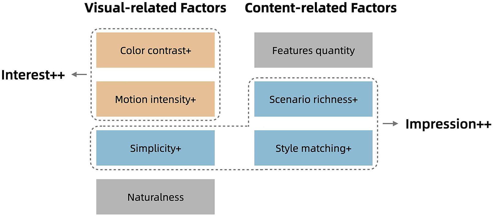
Figure 11. The influential design factors verified by online study.
The naturalness and feature quantity were proposed as factors by participants in the interview, but they did not show significant effects in the following online study. Both natural and unnatural designs might work well. Also, the appropriate number of features might change with the products, and thus did not have a general criterion.
The effects of these design factors have similarities and differences with the effects reported in prior studies. First, our study strengthens the superior of product GIFs in viewers’ engagement, expanding the research of product presentation based on AIDMA models. It shows that design factor in GIFs not only influence viewers’ attention but also interest and impression. However, the effect of design factors differs at different perceptual stages (interest or impression), which is different with prior opinions that attention-enhancing GIFs can also enhance memory at the same time (Lai et al. Reference Lai, Kuan, Hui and Liu2009; Hong et al. Reference Hong, Cheung and Thong2021). The result indicates that designers should consider enhancing certain design factors up to their purpose. Second, compared with studies on graphic design, this article found similar design factors of motion (Fasolo et al. Reference Fasolo, Misuraca, McClelland and Cardaci2006; Hamborg et al. Reference Hamborg, Bruns, Ollermann and Kaspar2012; Lee et al. Reference Lee, Ahn and Park2015; Li et al. Reference Li, Huang and Bente2016; Jia et al. Reference Jia, Kim and Ge2020; Hong et al. Reference Hong, Cheung and Thong2021), color (Borkin et al. Reference Borkin, Vo and Bylinskii2013; Wei Reference Wei2014; Celhay et al. Reference Celhay, Magnier and Schoormans2020) and scenario (Luo Reference Luo2002; Lehnert et al. Reference Lehnert, Till and Carlson2013; González et al. Reference González, Meyer and Paz Toldos2021), importing design factors of simplicity and style matching. Color and scenarios thus might have a wide influence on multiple types of media. However, the naturalness, which is reported to enhance comprehension and attention (Paik & Schraw Reference Paik and Schraw2013; Amini et al. Reference Amini, Riche, Lee, Leboe-McGowan and Irani2018; Bashirzadeh et al. Reference Bashirzadeh, Mai and Faure2021), does not lead to higher interest or impression. Our findings might also support the production of other forms of GIFs when producers want viewers to become interested and remember the content they express.
6.2. Methodology and guidelines for co-designing product GIFs
Since the design for product GIFs in e-commerce platforms often blends formal and informal knowledge, we sought an integrated solution (Gaete Cruz et al. Reference Gaete Cruz, Ersoy, Czischke and Van Bueren2023). In Studies 1 and 2, we expanded the joint collaboration by consulting the perspectives of viewers, merchants and designers. This identified seven design factors that augment the interest and impression of GIFs. These empirical insights were summarized into “guideline” and applied in Study 3, where merchants provided information about products and designers offered referring templates of product GIFs. The “guideline” acted as a trigger whose application enhance the final design of GIFs.
In practical codesign scenarios, merchants (non-designers) and designers participated asynchronously to design product GIFs, similar to Manzini’s description of collaboration (Manzini Reference Manzini2015). First, designers uploaded design templates in accordance with the guidelines. Then, the Luban platform equipped non-designers with these scaffolded design templates to facilitate their design. Last, non-designers chose suitable templates and added their own product information to realize the final design. The guideline provided suggestions and facilitated participation of novice and non-designers, thus increasing the overall efficiency of GIF production.
The co-designed GIF templates were found to be performing well in practical commercial applications. It shows that making product GIFs based on our findings is effective for designers and appreciated by non-designers (merchants). In this section, we put forward five design suggestions with visual cues and wish co-designers can be inspired. These design suggestions may help product GIF designers if they want to get viewers interested and impressed. The examples in this section were all produced in our workshop.
6.2.1. a. Use high-contrast colors to highlight the product and its features
Our study showed that color plays an important role in the visual perception of product GIFs. For example, participant 4 in the interview mentioned “The red strawberries are brightly colored and stand out in the picture,” while participant 15 commented on the gray shoes “The dynamic grey dust makes it impossible for me to notice the GIF, not to mention interest.” In the workshop, we suggest designers use red color to indicate the warmth of the boots, which is in sharp contrast to both the background and product color (as shown in Figure 12).

Figure 12. An example of using high-contrast colors.
6.2.2. b. Enlarge animated effects
Designers can increase viewers’ interest in product GIFs by enlarging the amplitude of motion and the proportion of animated elements. Viewers can easily notice a product GIF with a large range of animation and get interested in it. As participant 6 said, “I clearly felt that I was sensitive to animated images and wanted to know more about them.” Otherwise, as participant 4 and participant 5 mentioned, “When the dynamic effect is subtle, I can hardly notice it while browsing.” As shown in Figure 13, we suggest designers reflect a strong effect by creating luminous elements that rapidly shrink toward the center.

Figure 13. An example of enlarging effects.
6.2.3. c. Adopt a simple design
Complicated visual design will interfere with viewers’ understanding and impression, especially when facing a pile of product GIFs. Therefore, adopting a simple design and avoiding superfluous and irrelevant effects is advisable. The latter disrupted viewers’ vision and prevent them from recalling the product. When participant 12 recalled PICs and GIFs she had viewed, she missed the one with “Dazzle, fast, eyeball-catching movements (I remember the moving background but have no idea about the product)” but recognized the simple one “Adding only water drops on the shoes made me remember its property of being water-proof.” In the workshop, a designer initially used a complex ripple pattern, which took away from the lightness of the shoe. By adopting our design suggestion, the ripples of the template were simplified into two layers of concentric circles, appropriately reflecting the lightness of the shoes (as shown in Figure 14).

Figure 14. An example of adopting simple design.
6.2.4. d. Create an immersive experience using scenarios
Suitable background patterns and elements build a scenario of experiencing the products, and make up for the lack of touching and feeling products online. In the interview, we showed a smartwatch with sliding interfaces, many interviewees have deep impressions on it because “Looking at this product GIF, I felt as if I was swiping the screen to see the functions of the watch.” In Figure 15, a designer creates an immersive feeling by realistic clouds and blue sky, the shoes float above the sea of clouds, which give people a sense of lightness. We recommend designers imagine the related feelings with the product and make the scenarios richer and more real. This factor also implies that merchants should give more consideration to the types of users and usage scenarios for their products.

Figure 15. An example of creating scenarios.
6.2.5. e. Echo product styles
When the visual type and animated elements do not match the style of the product, it can be counterproductive to viewers’ impressions. In the online study, the most forgettable product GIF is a pair of elegant style shoes with updraft airflows. We propose that this dynamic effect is appropriate for sneakers, not for high heels, so it badly interferes with viewers’ memory. In the workshop, we suggest designers to figure out the products’ style first, and then create the element and background. We also categorize templates by product styles or types to help merchants make efficient decisions. For example, Figure 16 creates the element of a magnifying glass with a crisp blue, and the sliding lens reflects the sense of technology, which matches the style of the sports shoes. This template is then classified into “sneaker” and “technological” on the platform.

Figure 16. An example of echoing styles.
In addition, the other two factors (naturalness and feature quantity) also bring some tips. The types and numbers of elements can be varied to serve the final visualization, while it should ideally be clear enough for viewers to comprehend. Overall, our design guidelines improve the efficiency and quality of codesign while still affording designers certain amount of freedom for creative expression.
Furthermore, the entire design process is iterative. Low template usage serves as an indicator of dissatisfaction from non-designers, enabling designers to collect information and subsequently update GIF templates to boost production. Correspondingly, the design guidelines are subjective to the iterative enhancement throughout the process.
6.3. Limitations and future work
Following the discussion above, we provide inspiring results for designers and researchers. Some of the methods and findings in this article are worth further exploration and some limitations should be taken into account.
First, the participants of the survey are limited to young women, and our interview is distributed within the student population. This selection is due to the limitation of research subjects and eliminates the influence of age and occupation. Though the people we investigated are the main force of online shopping, there is still a certain design bias, making the universality of design suggestions questionable. We hope to extend future work to larger populations and further investigate the effects of human characteristics on perception during viewing product GIFs.
Second, our research mainly focuses on woman shoes, and our corpus of product GIFs is limited. The stability of the category and corpus is aimed to reduce the product’s interference with the viewer’s judgment. However, due to the controlled experimental materials, some design characteristics may be missed out. For example, the possible design factors in emotional dimension are not included in this work since the GIFs we selected tend not to evoke negative emotions. Also, the number of GIF templates applied at present is relatively small. In future work, we would explore design factors related to emotion, of which arousal level may impact impression on products (Choi et al. Reference Choi, Jung, Oyunbileg and Yang2016; Berni et al. Reference Berni, Borgianni, Basso and Carbon2023). We should also provide more templates for different products to verify the availability of our design suggestions.
Last, our analysis of the design factors is mainly based on subjective data. In Studies 1 and 2, we collect scoring from the questionnaire and participants’ feedback, which lack more objective data such as eye movement. In Study 3, more direct data such as conversion rates for products are not available due to trade secrets, which hinders us from understanding whether our product GIFs enhance audience interest and impression. Since merchants know their consumers, the choice of merchants, to a certain extent, also reflect the preference of their consumers. Future work would propose objective methods to measure viewers’ interest and impression, and create a realistic, higher-quality shopping experience for customers through product GIFs.
7. Conclusion
This article explores the design factors of product GIFs, a promising genre of graphic advertising. It locates key design factors that designers should pay attention to. Inspired by the prevalence of product GIFs on apps and websites, we analyzed how a product GIF interests and impresses its audiences. We first collected viewers’ feedback through a semi-structured interview and summarized seven design factors of product GIFs. Then, we conducted an online study. The results indicated that these design factors have varied impacts on interest and impression. Finally, the workshop we conducted indicated the accessibility of design factors in inspiring designers in design practice. The results and suggestions might also inspire the design of dynamic displays, such as data GIFs and story animations.
Our work is among the first to analyze the impact of design factors on product GIFs. Further studies would generalize the results to other product categories (clothing, electronic products, food, etc.), and incorporate objective measurements such as eye movements and EEG data. Given the wide use of product GIFs, future studies would also explore the design factors influencing perceptual dimensions such as preference and trust. Future research will be conducted with workshops on specific factors. In addition to helping designers, we also want to know the actual impact of different factors on consumer conversion rates and product impressions.
Acknowledgment
We thank all the interviewees, designers and merchants who participated in this work.
Financial support
This work is supported by the National Key Research and Development Program of China (Grant No. 2021YFF0900602).

