
Book contents
- Frontmatter
- Contents
- List of Figures
- Acknowledgments
- Introduction: The Entire Visual World
- 1 Designs on 1960s New York: The Image of Pop and North by Northwest
- 2 Breaking the Rules with the Beetle: Volkswagen’s Revolutionary Advertising and the Visual Wit of Andy Warhol’s Pop Art
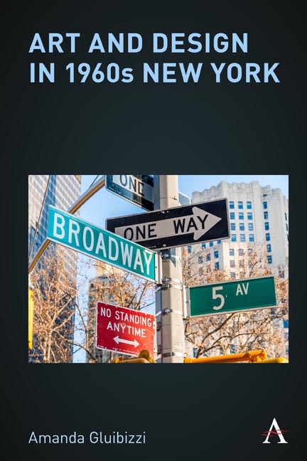
- 3 Navigating by the Vernacular Glance: Billboards, Signs, and the Urban Combine
- 4 Way-Words: Wayfinding by Following Pieces
- 5 What’s the Matter with the Megalopolis?
- Notes
- Bibliography
- Index
3 - Navigating by the Vernacular Glance: Billboards, Signs, and the Urban Combine
Published online by Cambridge University Press: 02 March 2021
- Frontmatter
- Contents
- List of Figures
- Acknowledgments
- Introduction: The Entire Visual World
- 1 Designs on 1960s New York: The Image of Pop and North by Northwest
- 2 Breaking the Rules with the Beetle: Volkswagen’s Revolutionary Advertising and the Visual Wit of Andy Warhol’s Pop Art
- 3 Navigating by the Vernacular Glance: Billboards, Signs, and the Urban Combine
- 4 Way-Words: Wayfinding by Following Pieces
- 5 What’s the Matter with the Megalopolis?
- Notes
- Bibliography
- Index
Summary
As we saw in the previous chapters, Andy Warhol's pop art and print advertising depended on similar logics of repetition, resulting in strategies that reinforced and exploited viewers’ expectations that they would see the same image again and again and that this repetition, rather than indicating a lack of imagination, would result in a reverberation effect that caused ripples throughout the viewer's visual world. Warhol's silk screens and Volkswagen's ads “worked” because their consumers learned to expect them and then, once expecting them, to depend on and anticipate their appearances. It is a scheme that Warhol continued to use throughout his painterly work and that advertising still practices.
But what is the effect on the surrounding environment into which such decisions insinuate themselves? How do repeated images— and especially advertising writ large in the form of posters and billboards— work with and against the ecosystems in which they are placed? And how do viewers navigate such cacophony? In order to consider such questions, we must look beyond Warhol, whose work, because it is single image dependent, feels too graphically disciplined to provide an indication. Rather, in this chapter, we shall turn to the Combines and screen paintings of Robert Rauschenberg, which operate as microcosmic city vistas and navigate through them.
In their use of detritus, newspaper and magazine photographs, and flashing lights, Rauschenberg's Combines and silk-screen images are perhaps the artist's best-known “urban” endeavors, but even in his earlier work, Rauschenberg showed an interest in the way that the eye would travel through or across his paintings. 22 The Lily White (ca. 1950), a white canvas, features a meander pattern of interlocking vertical and horizontal rectangles. Within the rectangles, Rauschenberg has scratched in graphite random numbers, some upright and others upside down (including, in the lower left section of the painting, “22 the lily white,” which gives the canvas its title). Whereas the vertical canvas and cascading shapes would seem to prompt our eyes to scan the surface of the painting, the numbers encourage viewers to pause and to orient and reorient ourselves to the picture's modes of address.
- Type
- Chapter
- Information
- Art and Design in 1960s New York , pp. 71 - 112Publisher: Anthem PressPrint publication year: 2021